The story behind the brand identity
How and why we chose the name and visual identity
Usually, when you start a business, the first thing you think about is what it will be called and what the logo will look like. Probably because these things are visible, tangible, and give you the feeling that the project is gaining momentum.
However, I’ve often encountered situations where the name and logo were ready, while the business strategy – from idea to product, services, and revenue streams – was far from what it should have been.
In reality, both the name and the visual identity should convey the essence of the business, and that essence can only be defined once the business plan is clearly outlined.
From Summerwell to strategy
The steps Claudia and I followed were simple and clear: we identified a real market need, checked the compatibility between that need and our experience, and made sure we had the necessary resources to serve it properly.
Once these aspects were clarified, we looked carefully at our relationship.
Are we personally compatible? Do we share common values? Professionally, do we complement each other or overlap? Do we see marketing, communication, and the industry the same way? Do we want to build something together, even knowing it won’t be easy?
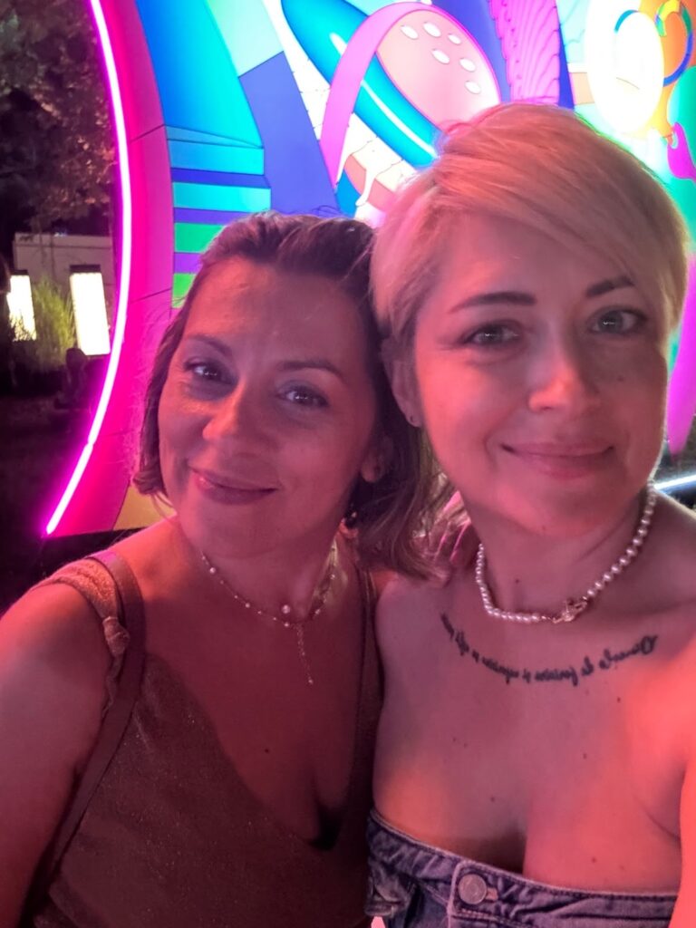
We’ve known each other for many years, but until then, our professional relationship had been limited to just a few meetings.
This photo was taken on August 9th 2025, at Summerwell, when our project was starting to take shape. Our teenage daughters instantly became friends, and we had a wonderful evening.
For me, that was the green light.
In search of a name
Once the business idea and our personal and professional compatibility were clear, we moved on to naming. The positioning was already defined – a strategic marketing agency specialized in the transport and logistics industry – because that was the very trigger we started from and also our key differentiator.
On the shortlist, we also had Pink Marketini and Clutch. The first was a wordplay inspired by a favorite cocktail. The second had a double meaning: handbag and car clutch. We liked both.
We brought in another consultant (yes, we needed objectivity), who told us: “Choose a stronger name, more masculine, less open to interpretation.”
DRIVION was already on the list, but we kept avoiding it. It felt a bit unusual, acronym-like—it didn’t spark the same instant appeal as the others. Until I realized I had become the kind of client who chooses based on taste, not strategy.
Ah, me of all people? Yes.
That was the moment both Claudia and I knew that Drivion was the right name.
Why DRIVION
The name brings together three concepts that define how we work:
DRIving – courage and applied experience
VIsion– ethics and long-term responsibility
decisiON – strategy and clear direction
…as well as the attributes any business in this industry needs to remain relevant over time.
Together, they define what DRIVION promises: long-haul marketing.
The small step that many skip
Once the name was chosen, we bought the domain. It may seem like a simple step, but it’s essential. Too often, entrepreneurs skip it or leave it for later, without realizing it’s part of strategy—not just an administrative task.
We’ll come back to this topic soon, because a domain is not just an address, it’s a brand asset.
Visual identity: without wheels, but with direction
The first thing Claudia said in the meeting with Anamaria Toader – a graphic designer with a background in psychology and part of the DRIVION team – was: “Please, no wheels!”
We laughed, but it’s not a joke: in many industries, visual identities tend to repeat the same symbols. In transport, you often see wheels, steering wheels, or roads. We wanted something different.
The DRIVION logo is not a font – it’s a custom logomark, drawn from scratch. A unique sign that cannot be replicated by simply using a typeface.

The typography is masculine, straight, sharp, with no rounded edges – it conveys strength, clarity, and authority. It’s our response in a male-dominated industry: not through softness, but through solid, intentional symbolism.
The favicon – the square with a needle – is not a wheel. It’s a dial reduced to its pure essence, which, depending on context, becomes:
A clock → journey time, the promise of “long-haul marketing”
A compass → strategic direction and long-term orientation
A calendar → planning and endurance discipline
A speedometer → energy, acceleration, and pace control, essential in logistics and strategy
This controlled ambiguity turns the logo into a powerful visual code – one that isn’t immediately explained, but gradually decoded over time, just like the strategies we build for our clients.
So DRIVION doesn’t just have a logo, it has a strategic symbol: simple, bold, memorable, with layers of meaning that grow and reveal themselves alongside the brand.
DRIVION in colors
The DRIVION colors are not random – each plays a clear role in the brand’s visual narrative:
🔵 Electric Blue symbolizes strategic vision and long-term trust. It’s an electric yet printable blue with a distinctive energy. It conveys leadership and stability in an endurance-driven industry, but in a different way: not corporate, but striking and electrifying.
🟢 Lime Neon symbolizes fresh impact and ethical responsibility, bringing visibility and vitality where logistics may feel rigid. It signals that DRIVION doesn’t follow old roads – it creates new, energetic, and ethical paths.
🟠 Flame Orange symbolizes the courage to break patterns and the power of fast decisions. It acts like a road warning light – you can’t ignore it. That’s how Drivion works: it clearly signals direction, makes firm decisions, and conveys boldness.
🟡 Yellow symbolizes attention, maximum visibility, and clarity of message. It’s the color of road safety. In DRIVION’s identity, it works like a road marking – highlighting what matters, providing safety, and emphasizing key messages.
In closing
And so, the first chapter of the DRIVION story is told.
Next comes how we build long-haul marketing: step by step, with purpose and without shortcuts.